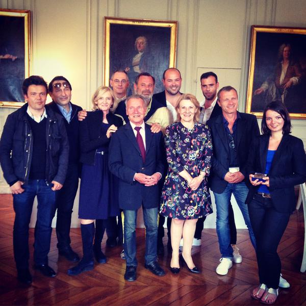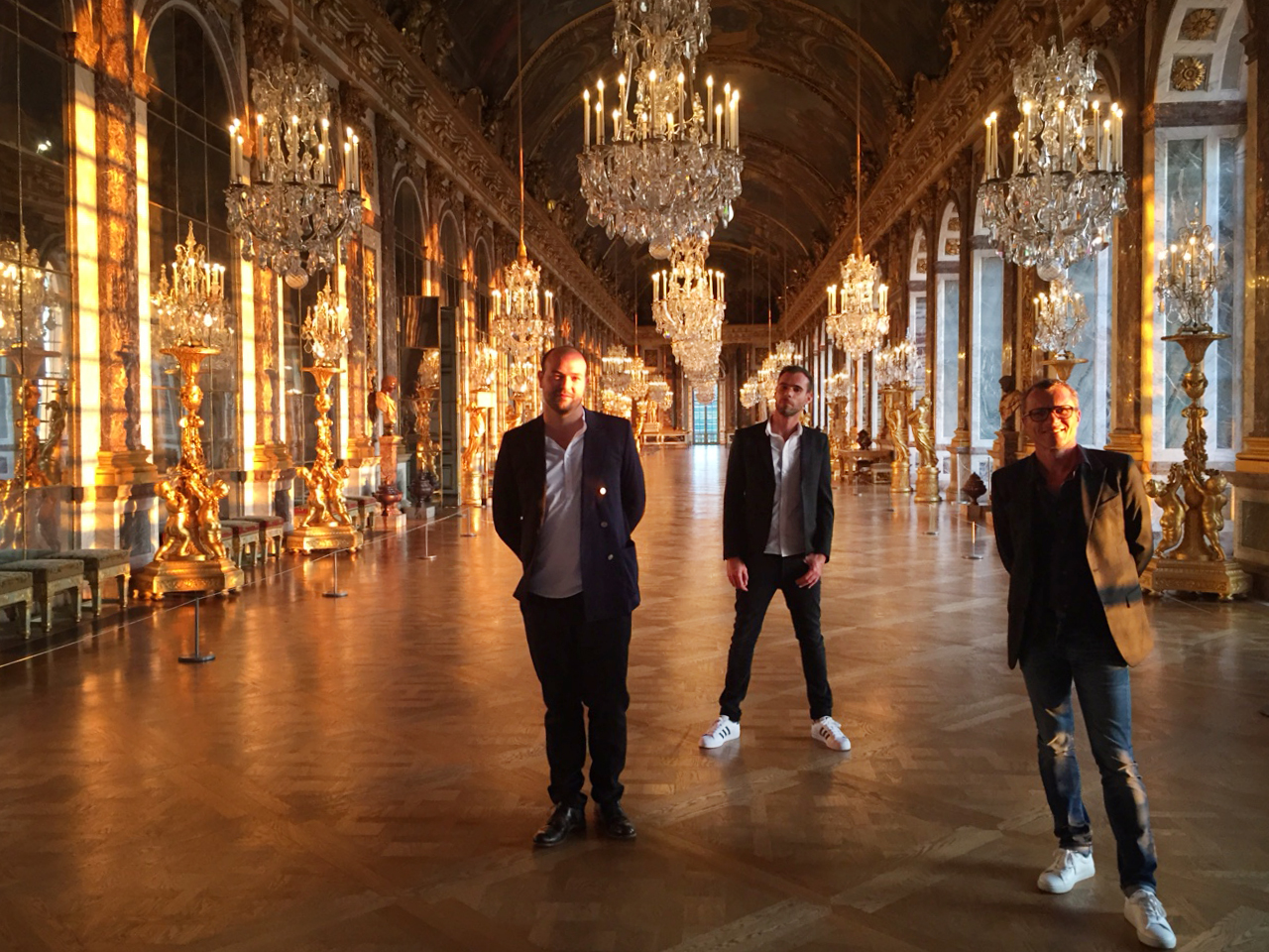

Les lauréats et le jury du concours Hack King's design / The winners and the jury of the Hack King's design contest pic.twitter.com/eus59gXIV5
— ChateaudeVersailles (@CVersailles) 26 Mai 2015Les lauréats et le jury du concours Hack King's design / The winners and the jury of the Hack King's design contest pic.twitter.com/eus59gXIV5
— ChateaudeVersailles (@CVersailles) 26 Mai 2015Nous sommes lauréats du concours de Design du Chateau de Versailles.
Vous avez été nombreux à voter sur le site du concours.
Nous vous en remercions !
We are winners of the design competition organized by the Palace of Versailles.
Many of you have voted on the competition website:
Thank you !
vincent coste reinterprets 18th century commode with 3D printed design
the collaborative team of vincent coste design et associés and Jbaptiste sénéquier has reinterpreted an 18th century commode, originally designed by famed cabinetmaker andré-charles boulle. the project has been entered as part of a competition organized by the palace of versailles, with the winning work forming part of the institution’s exhibition: ‘18th century, birth of design’. based on a digital file, participants were encouraged to propose a new item of furniture that could be produced using 3D printing techniques to the maximum of their current capacities.
‘we extracted the ornament of the commode and left the 3D printing software to interpret it’, explained the design team. the competition jury includes architect jean nouvel and designer ronan bouroullec. you can vote on your preferred design on the competition’s website, before a winner is announced during the week of february 23, 2015.
vincent coste forms triangular A3 house with panoramic view of france
The designers of vincent coste architecte have completed a 200-meter residential structure called ‘A3 house’ in toulon, france. the plan of the villa is organized within the confines of a triangular volume. it has a double vision, meaning that it simultaneously opens towards the bay of sanary and the harbor of toulon. the idea was to orient each space on both panoramas, hence the shape allowed the architects to develop a greater frontage of 35 meters long. towards the front of the dwelling, the sleeping areas and service functions meet at a perpendicular intersection to shield the public spaces from the road.
a corridor from the entry leads to the living room, kitchen and master bedroom. as residents circulate they are presented with a zig-zagging edge formed by a series of partitions changing from solid to glazed, depending on the corresponding interior activity. the sharp corners are oriented in a manner that provides perspectives of the sky ranging from sunrise to sunset. from here, continuity is developed by the ability for each room to open as a subspace of the summer room, outdoor kitchen, and jacuzzi. conversely, the private zones are rotated towards the entrance façade and the interior garden. the entire complex is clad in extruded terracotta custom-designed by les rairies montrieux for the project.
From the architect. The plan of this villa is in a triangle. It has a double vision: it opens on the bay of Sanary and that of Toulon. The idea was to orient each space on both panoramas, hence his plane triangle which allowed to develop a greater frontage of 35 meters long.
The living spaces are oriented on both views from sunrise to sunset. Each space (living room, kitchen, master bedroom) opens as a subspace of the terrace (summer room, summer kitchen jakuzzi) in a total interior and exterior continuity /. Conversely, the private spaces are oriented towards the entrance façade and the interior garden.
Situated to Gassin, to the crossroads of roads leading to the Gulf of Saint-Tropez, this project contains the rehabilitation of a sales area of wine as well as the implementation of a facade allowing a better legibility of buildings.
This part of the wanted program, was envisaged through a wide metallic structure allowing the implementation of a wooden meshing (red cedar) allowing to pass the light and bringing a foreground allowing to restore a visual unity to heterogeneous all the existing buildings.
The interior design articulates around a welcome area handled by the implementation of a grill from which are suspended wide lightings values podia for every domain presented to the customers
The zone of sale and tasting presents bottles on all the wall surfaces. What allows an emphasis of every product. Wide elements of furniture in oak, drawn specially, articulate the circulation of the customers.
The esthetic treatment of the sales area brings a sensation of simplicity by the rigorous and simple using of materials. This bias was motivated by the closeness of the beaches of the golf and the type of mode of consumption of products presented in summer.
vincent coste combines the worlds of cheese and wine in france
rench architecture firm, vincent coste architecte locates ‘la fromagerie du passage’ at the center of an ancient benedictine cloister in the historic french city of aix-en-provence. the concept store marries the world of wine and cheese through carefully initiated design characteristics. three levels vertically displace the programs of the design brief in a local and contemporary fashion. the ground floor retail space includes an aromatic cheese tasting display that faces the wooden beech plank exhibition and sales desk, which are intended to appear as a bookshelf of bottles. two of the meilleurs ouvriers de france (best workers in france) attend the station, where they are in charge of refining and selecting the wine to develop a sustainable and informed consumption of the two products. the prestigious title refers to a competition held every four years to determine the best craftsmen of the country. decorating the surfaces are simple geometric concrete tiles that unite the space and give it a strong identity amongst other storefronts along the street.
the first floor mezzanine offers two dining options: a long counter directly above the double height ceiling, and a long table d’hôte, which is divided according to the circulation requirements of the employees and customers. the counter, a wide wooden balcony that lines the extents of one edge, generates the composition of the façade and reinforces the perception of the interior from the street.
the top level has allowed the establishment of a terrace within the context of the city’s rooftops. each component of furniture (shelves sale, tables, maturing cellar, and showcases sale) have been specifically created to optimize their use and respond to the technical demands of cheesemakers and winemakers.
photo © florent joliot
all images courtesy of vincent coste architecte
designboom
A Gassin, sur les routes menant au Golfe de Saint-Tropez, l’agence d’architecture Vincent Coste Design Studio a réalisé la réhabilitation de Maîtres Vignerons Saint-Tropez, un espace dédié à la vente de vin.
Afin d’accentuer la lisibilité des bâtiments, les architectes ont ajouté au projet une façade composée d’une structure métallique accueillant un maillage de bois. Composante essentielle du projet, cette nouvelle structure laisse subtilement filtrer la lumière tout en unifiant l’ensemble hétéroclite des bâtiments existants.
A l’intérieur, l’espace s’articule autour de podiums dédiés aux différents domaines viticoles. L’aspect élégant et épuré est souligné par l’emploi de bois de chêne qui confère à l’ensemble une touche chaleureuse et terroir, en adéquation avec le vin qu’il met en avant.
Pour en savoir plus, visitez le site de Vincent Coste Design Studio et celui des Maîtres Vignerons de Saint-Tropez.
http://www.archidesignclub.com/magazine/rubriques/architecture/45851-vincent-coste-design-studio-maîtres-vignerons-saint-tropez.html … #architecture #vin #cave #paca
Drawn for a gallery owner and her husband, this house finished in 2013 in Saint-Tropez becomes established on a very narrow ground.
Developing all living areas upstairs this option allowed to be free from street level by capturing the surrounding areas. The large patio on all intimate rooms of the ground floor provides perspectives from each of these parts to the upper level.
The spaces are well united around the long pool. The front of this volume cantilevered overhang is dressed of natural terracotta cladding specially developed for the project.
By creating a texture cast shadows throughout the house, these facade elements mingle with the cast shadows of the removable pergolas.